Showing posts with label "There's not a lot of reader confusion out there". Show all posts

Friday, November 15, 2019

PolitiFact editor: "It’s important to note that we don’t do a random or scientific sample"

As we have mentioned before, we love it when PolitiFact's movers and shakers do interviews. It nearly guarantees us good material.

PolitiFact Editor Angie Drobnic Holan appeared on Galley by CJR (Columbia Journalism Review) with Mathew Ingram to talk about fact-checking.

During the interview Ingram asked about PolitiFact's process for choosing which facts to check (bold emphasis added):
MI
One question I've been asking many of our interview guests is how they choose which lies or hoaxes or false reports to fact-check when there are just so many of them? And do you worry about the possibility of amplifying a fake news story by fact-checking it? This is a problem Whitney Phillips and Joan Donovan have warned about in interviews I've done with them about this topic.
ADH
Great questions! We use our news judgement to decide what to fact-check, with the main criteria being that it’s a topic in the news and it’s something that would make a regular person say, "Hmmm, I wonder if that’s true." If it sounds wrong, we’re even more eager to do it. It’s important to note that we don’t do a random or scientific sample.
It's important, Holan says, to note that PolitiFact does not do a random or scientific sample when it chooses the topics for its fact check stories.

We agree wholeheartedly with Holan's statement in bold. And that's an understatment. We've been harping for years on PolitiFact's failure to make its non-scientific foundations clear to its audience. And here Holan apparently agrees with us by saying it's important.

How important is it?

PolitiFact's statement of principles says PolitiFact uses news judgment to pick out stories, and also mentions the "Is that true?" standard Holan mentions in the above interview segment. But what you won't find in PolitiFact's statement of principles is any kind of plain admission that its process is neither random nor scientific.

If it's important to note those things, then why doesn't the statement of principles mention it?

At PolitiFact, it's so important to note that its story selection is neither random nor scientific that no example from three pages of Google hits in the politifact.com domain when searching for "random" AND "scientific" has anything to do with PolitiFact's method for story selection.

And despite commenters on PolitiFact's Facebook page commonly interpreting candidate report cards as representative of all of a politician's statements, Holan insists "There's not a lot of reader confusion" about it.
If there's not a lot of reader confusion about it, why say it's important to note that the story selection isn't random or scientific? People supposedly already know that.

We use the tag "There's Not a Lot of Reader Confusion" on occasional stories pointing out that people do suffer confusion about it because PolitiFact doesn't bother to explain it.

Post a chart of collected "Truth-O-Meter" ratings and there's a good chance somebody in the comments will extrapolate the data to apply to all of a politician's statements.

We say it's inexcusable that PolitiFact posts its charts without making their unscientific basis clear to readers.

They just keep right on doing it, even while admitting it's important that people realize a fact about the charts that PolitiFact rarely bothers to explain.

Friday, February 1, 2019

Not a Lot of Reader Confusion XII

We say that PolitiFact's graphs and charts, including its PunditFact collections of ratings for news networks, routinely mislead readers. But PolitiFact Editor Angie Drobnic Holan says there isn't much reader confusion.


Ho-hum. Another day, another example showing that PolitiFact's charts and graphs mislead its readers.

When Sen. Cory Booker (D-NJ) announced he was running for president, PolitiFact was on the case looking for clicks by publishing one of its misleading graphs of Booker's (subjective) "Truth-O-Meter" ratings.

PolitiFact used a pie chart visual with its Facebook posting:


Note the absence of any disclaimer admitting that selection bias affects story selection, along with no mention of the fundamental subjectivity of the "Truth-O-Meter" ratings.

How is this type of graph supposed to help inform PolitiFact's readers? We say it misinforms readers, such as those making these types of comments (actual comments from PolitiFact's Facebook page in response to the Booker posting):

  • "A pretty sad state of affairs when a candidate lies or exaggerates 35% of the time."
  • "Funny how Politifact find Trump lying about 70% of the time." 
  • "(W)hile that's much better than (T)rump's scorecard, it's not honest enough for my tastes."


PolitiFact seems to want people to vote for the candidate with the best-looking scorecard. But given that the ratings are subjective and the stories are selected in a non-random manner (nearly guaranteeing selection bias), the "best" scorecard is, in effect, an editorial position based on opinions, not facts.

PolitiFact is selling editorials to its readers with these graphs.

Many in the fact-checking community oppose the use of gimmicky meters (FactCheck.org, Full Fact (UK), for example). If the International Fact-Checking Network and PolitiFact were not both under the auspices of the Poynter Institute then perhaps we'd soon see an end to the cheesy meters.


Correction May 3, 2019: We did XI twice! We updated the second XI to change the title to XII and now we're changing the title of this one to XIII.

Wednesday, January 23, 2019

Not a Lot of Reader Confusion XII

We say that PolitiFact's graphs and charts, including its PunditFact collections of ratings for news networks, routinely mislead readers. But PolitiFact Editor Angie Drobnic Holan says there isn't much reader confusion.

Today on its Facebook Page, PolitiFact continued its custom of highlighting one of its politician "report cards."

In keeping with our expectation that PolitiFact's report cards mislead the PolitiFact audience, we found the following:


We're not making the commenters impossible to verify, but we're blacking out the names and emphasizing that nobody should harass these people over their comments in any way. Somebody already pointed out a problem with their view, so there's not even a need to do that. Just leave it alone and allow this to stand as the latest proof that PolitiFact has its head in the sand over the way its charts mislead its audience. That's using the charitable assumption that PolitiFact isn't deliberately deceiving its audience.

As we have endlessly pointed out, the non-scientific method PolitiFact uses to sample the universe of political claims make statements about the overall percentages of false statements unreliable.

PolitiFact knows this but declines to make it clear to readers with the use of a consistent disclaimer.

The type of response we captured above happens routinely.


Correction May 3, 2019: We did XI twice! Fixed the title to reflect the more accurate count.

Wednesday, May 16, 2018

Not a Lot of Reader Confusion XI

We say that PolitiFact's graphs and charts, including its PunditFact collections of ratings for news networks, routinely mislead readers. But PolitiFact Editor Angie Drobnic Holan says there isn't much reader confusion.
 
A comment today at PolitiFact's Facebook page reminds us yet again that PolitiFact's graphs and charts mislead its audience.


The comment referred to PolitiFact Editor Angie Drobnic Holan's Dec. 11, 2015 opinion article in The New York Times. When a reader scoffed at the use of the Times as a reliable reference the person making the comment defended it with this (bold emphasis added):
ALL of the statistics both come from Politifact itself. I use it because it has a very nice graphic that clearly shows that Republicans as a whole are far more full of pony poop than Democrats are.
As we've pointed out repeatedly, PolitiFact has admitted its "Truth-O-Meter" ratings are subjective and that its sampling method makes no attempt to simulate randomness (therefore one may assume the data suffer from selection bias).

Yet another satisfied PolitiFact customer, misled in a way that Holan says doesn't happen a lot.

If it doesn't happen very often then why is it so easy to find examples of it happening, we wonder?

If PolitiFact was concerned about misleading people in this way, then it would attach disclaimers to every one of its graphs to warn against jumping to conclusions the PolitiFact data cannot rightly support.

Thursday, April 12, 2018

Not a Lot of Reader Confusion X: "I admit that there are flaws in this ..."

So hold my beer, Nelly.

We say that PolitiFact's graphs and charts, including its PunditFact collections of ratings for news networks, routinely mislead readers. But PolitiFact Editor Angie Drobnic Holan says there isn't much reader confusion.

Quite a few folks apparently have no clue at all that PolitiFact's charts and graphs lack anything like a scientific basis. Others know that something isn't right about the charts and graphs but against all reason find some value in them anyway.

PolitiFact itself would fall in the latter camp, based on the way it uses its charts and graphs.

So would Luciano Gonzalez, writing at Patheos. Gonzalez listened to Speaker of the House Paul Ryan's speech announcing his impending retirement and started wondering about Ryan's record of honesty.

PolitiFact's charts and graphs don't tell people about the honesty of politicians because of many flaky layers of selection bias, but people can't seem to help themselves (bold emphasis added):
I decided after hearing his speech at his press conference to independently check if this House Speaker has made more honest claims than his predecessors. To did this I went to Politifact and read the records of Nancy Pelosi (House Speaker from January 4th 2007-January 3rd 2011), John Boehner (House Speaker from January 5th 2011-October 29th, 2015), and of course of the current House Speaker Paul Ryan (October 29th 2015 until January 2019). I admit that there are flaws in this, such as the fact that not every political claim a politician makes is examined (or even capable of being examined) by Politifact and of course the inherent problems in giving political claims “true”, “mostly”, “half-true”, “mostly false”, “false”, & “pants on fire” ratings but it’s better than not examining political claims and a candidate’s level of honesty or awareness of reality at all.
If we can't have science, Gonzalez appears to say, pseudoscience is better than nothing at all.

Gonzalez proceeds to crunch the meaningless numbers, which "support" the premise of his column that Ryan isn't really so honest.

That accounts for the great bulk of Gonzalez's column.

Let's be clear: PolitiFact encourages this type of irresponsible behavior by publishing its nonsense graphs without the disclaimers that spell out for people that the graphs cannot be reasonably used to gauge people's honesty.

PolitiFact encourages exactly the type of behavior that fact checkers ought to discourage.

Tuesday, March 20, 2018

Not a Lot of Reader Confusion IX

We say that PolitiFact's graphs and charts, including its PunditFact collections of ratings for news networks, routinely mislead readers. But PolitiFact Editor Angie Drobnic Holan says there isn't much reader confusion.

In a March 19, 2018 column published by The Hill, liberal radio talk show host Bill Press declared that we can't believe what President Donald Trump says.

What evidence did Press have to support his claim?

PolitiFact.

Press (bold emphasis added):
Trump tells so many lies, so often, that not even Politifact, the Pulitzer Prize-winning, nonpartisan fact-checking website can keep score. But they do the most thorough job of anybody. Since he launched his 2016 campaign, Politifact has evaluated more than 500 assertions made by candidate and president Donald Trump, and they’ve rated an astounding 69 percent of them as “false,” “mostly false,” or, the worst category, “liar, liar, pants on fire.” Think about that. On any given day, you know that seven out of ten things Donald Trump says are not true!
We at PolitiFact Bias have endlessly pointed out that even if one assumes that PolitiFact did its fact checks without mistakes that selection bias and subjective application of its rating system make claims like the one in bold ridiculous.

Claims mirroring the one above happen routinely, yet PolitiFact denies the evidence ("not a lot of reader confusion") and continues publishing its misleading charts and graphs with no explanatory disclaimer.

We can think of two primary potential explanations.
  • PolitiFact truly doesn't see the abundance of evidence even though we jump up and down calling attention to it
  • PolitiFact is deliberately misleading people
 We invite readers to provide alternative possibilities in the comments section.


Tuesday, December 26, 2017

Not a Lot of Reader Confusion VIII

We say that PolitiFact's graphs and charts, including its PunditFact collections of ratings for news networks, routinely mislead readers. PolitiFact Editor Angie Drobnic Holan says she doesn't notice much of that sort of thing. This series looks to help acquaint Holan and others with the evidence.


Oh, look. Another journal article using PolitiFact's report card data to judge the veracity of a politician (bold emphasis added):
Political fact-checking organizations and the mainstream media reported extensively on Trump’s false statements of fact and unsubstantiated generalizations. And they noted that he made such statements in staggering proportions. For example, by April of 2017, Politifact assessed 20% of Trump’s statements as mostly false, 33% as false, and 16% as what it called “pants on fire” false— cumulatively suggesting that the vast majority of the time Trump was making either false or significantly misleading statements to the public.
That's from The Resilience of Noxious Doctrine: The 2016 Election, the Marketplace of Ideas, and the Obstinacy of Bias.

The article, by Leonard M. Niehoff and Deeva Shah, appeared in the Michigan Journal of Race and Law.

The authors should be ashamed of themselves for making that argument based on data subject to selection bias and ideological bias.

On the bright side, we suppose such use of PolitiFact data may successfully model the obstinacy of bias.

We recommend to the authors this section of their article:
Confirmation bias, discussed briefly above, is another common type of anchoring bias. Confirmation bias describes our tendency to value facts and opinions that align with those we have already formed. By only referencing information and viewpoints that affirm previously held beliefs, people confirm their biased views instead of considering conflicting data and ideas.


Correction: Fixed link to Noxious Doctrine paper 1838PST 12/26/2017-Jeff

Friday, December 1, 2017

Not a Lot of Reader Confusion VII

We say that PolitiFact's graphs and charts, including its PunditFact collections of ratings for news networks, routinely mislead readers. PolitiFact Editor Angie Drobnic Holan says she doesn't notice much of that sort of thing.

We're here to help.

This comes from the lead edge of December 2017 and PolitiFact's own Facebook page:


Somebody introduced a subjective PolitiFact chart in answer to a call for a scientific study showing the unreliability of Fox News. So far as we can tell, the citation was intended as serious.

We predict that no number of examples short of infinity will convince Holan that we are right and she is wrong. At least publicly. Privately, maybe.

Friday, November 10, 2017

'Not a lot of reader confusion' VI

PolitiFact editor Angie Drobnic Holan has claimed she does not notice much reader confusion regarding the interpretation of PolitiFact's "report card" charts and graphs.

This series of posts is designed to call shenanigans on that frankly unbelievable claim.

Rem Rieder, a journalist of some repute, showed himself a member of PolitiFact's confused readership with a Nov. 10, 2017 article published at TheStreet.com.
While most politicians are wrong some of the time, the fact-checking website PolitiFact has found that that [sic] Trump's assertions are inaccurate much more frequently than those of other pols.
When we say Rieder showed himself a member of PolitiFact's confused readership, that means we're giving Rieder the benefit of the doubt by assuming he's not simply lying to his readers.

As we have stressed repeatedly here at PolitiFact Bias, PolitiFact's collected "Truth-O-Meter" ratings cannot be assumed to reliably reflect the truth-telling patterns of politicians, pundits or networks. PolitiFact uses non-random methods of choosing stories (selection bias) and uses an admittedly subjective rating system (personal bias).

PolitiFact then reinforces the sovereignty of the left-leaning point of view--most journalists lean left of the American public--by deciding its ratings by a majority vote of its "star chamber" board of editors.

We have called on PolitiFact to attach disclaimers to each of its graphs, charts or stories related to its graphs and charts to keep such material from misleading unfortunate readers like Rieder.

So far, our roughly five years of lobbying have fallen on deaf ears.

Friday, September 22, 2017

Joy Behar lies 100 percent of the time. It's from PolitiFact.

Of course the title of this post is intended solely to draw attention to its content. We do not think Joy Behar lies 100 percent of the time, no matter what PolitiFact or Politico say.

For the record, Behar's PolitiFact file as of Sept. 19, 2017:


As we have noted over the years, many people mistakenly believe  PolitiFact scorecards reasonably allow one to judge the veracity of politicians and pundits. We posted about Behar on Sept. 7, 2017, noting that she apparently shared that mistaken view.

PolitiFact surprised us by fact-checking Behar's statement. The fact check gave PolitiFact the opportunity to correct Behar's core misperception.

Unfortunately, PolitiFact and writer Joshua Gillin blew the opportunity.

A representative selection of statements?


Critics of PolitiFact, including PolitiFact Bias, have for years pointed out the obvious problems with treating PolitiFact's report cards as a means of judging general truthfulness. PolitiFact does not choose its statements in way that would ensure a representative sample, and an abundance of doubt surrounds the accuracy of the admittedly subjective ratings.

Gillin's fact check rates Behar's conclusion about Trump's percentage of lies "False," but he succeeds in tap-dancing around each of the obvious problems.

Let Fred Astaire stand aside in awe (bold emphasis added):
It appeared that Behar was referring to Trump’s PolitiFact file, which tracks every statement we’ve rated on the Truth-O-Meter. We compile the results of a person's most interesting or provocative statements in their file to provide a broad overview of the kinds of statements they tend to make.
Focusing on a person's most interesting or provocative statements will never provide a broad overview of the kinds of statements they tend to make. Instead, that focus will provide a collection of the most interesting or provocative statements the person makes, from the point of view of the ones picking the statements. Gillin's statement is pure nonsense, like proposing that sawing segments from a two-by-four will tend to help lengthen the two-by-four. In neither case can the method allow one to reach the goal.

Gillin's nonsense fits with a pattern we see from PolitiFact. Those in charge of PolitiFact will occasionally admit to the problems the critics point out, but PolitiFact's daily presentation obscures those same problems.

Gillin sustains the pattern as his fact check proceeds.

When is a subjective lie an objective lie?


In real life, the act of lying typically involves an intent to deceive. In PolitiFact's better moments, it admits the difficulty of appearing to accuse people of lying. In a nutshell, it's very dicey to state as fact a person was lying unless one is able to read minds. But PolitiFact apparently cannot resist the temptation of judging lies, or at least the temptation of appearing to make those judgments.

Gillin (bold emphasis added):
Behar said PolitiFact reported that "95 percent of what (Trump) says is a lie."

That’s a misreading of Trump’s file, which notes that of the 446 statements we’ve examined, only 5 percent earned a True rating. We’ve rated Trump’s statements False or Pants On Fire a total of 48 percent of the time.

The definitions of our Truth-O-Meter ratings make it difficult to call the bulk of Trump’s statements outright lies. The files we keep for people's statements act as a scorecard of the veracity of their most interesting claims.
Is Gillin able to read minds?

PolitiFact's fact checks, in fact, do not provide descriptions of reasoning allowing it to judge whether a person used intentionally deceptive speech.

PolitiFact's report cards tell readers only how PolitiFact rated the claims it chose to rate, and as PolitiFact's definitions do not mention the term "lie" in the sense of willful deception, PolitiFact ought to stick with calling low ratings "falsehoods" rather than "lies."

Of course Gillin fails to make the distinction clear.

We are not mind readers. However ...

Though we have warned about the difficulty of stating as fact that a person has engaged in deliberate deception, there are ways one may reasonably suggest it has occurred.

If good evidence exists that a party is aware of information contradicting that party's message and the party continues to send that same message anyway, it is reasonable to conclude that the party is (probably) lying. That is, the party likely engages in willful deception.

The judgment should not count as a matter of fact. It is the product of analysis and may be correct or incorrect.

Interviews with PolitiFact's principal figures often make clear that judging willful deception is not part of their fact-checking process. Yet PolitiFact has a 10-year history of blurring the lines around its judgments, ranging from the "Pants on Fire" rating ("Liar, liar, pants on fire!") for "ridiculous" claims, to articles like Gillin's that skip opportunities to achieve message clarity in favor of billows of smoke.

In between the two, PolitiFact has steadfastly avoided establishing a habit of attaching appropriate disclaimers to its charts and graphs. Why not continually remind people that the graphs only cover what PolitiFact has rated after judging it interesting or provocative?

We conclude that PolitiFact wants to imply that some politicians habitually tell intentional falsehoods while maintaining its own plausible deniability. In other words, the fact checkers want to judge people as liars under the deceptive label of nonpartisan "fact-checking" but with enough wiggle room to help shield it from criticism.

We think that is likely an intentional deception. And if it is intentional, then PolitiFact is lying.

Why would PolitiFact engage in that deception?

Perhaps it likes the influence it wields on some voters through the deception. Maybe it's just hungry for click$. We're open to other explanations that might make sense of PolitiFact's behavior.

Thursday, September 7, 2017

"Not a lot of reader confusion" V

When will PolitiFact give up its absurd notion that its graphs and tables do not mislead large numbers of people?

Joy Behar of ABC's "The View" recently challenged White House spokesperson Sarah Sanders on the basis that PolitiFact says 95 percent of President Donald Trump's statements are untrue:
Joy Behar asked Sanders about a PolitiFact report that found 95 percent of the president's statements were less than completely true.

"The problem with that, Joy, is that you are doing exactly what we're talking about," Sanders responded. "Pushing a false narrative."
Apparently Sanders was the only person on the set who challenged the false narrative Behar was peddling.

For those PolitiFact continues to mislead, we repeat that if PolitiFact fails to use a representative sample of statements when it publishes its graphs and charts then the percentages tell you the opinions of PolitiFact editors for a select set of statements, not the percentage chance that a typical Trump statement is untrue.

(fingers crossed that the ABC embed works)


Not a lot of reader confusion? Seriously?

Give us a break, PolitiFact.

Sunday, July 30, 2017

"Not a lot of reader confusion" IV

PolitiFact editor Angie Drobnic Holan has famously defended PolitiFact's various "report card" graphs by declaring she does not observe much reader confusion. Readers, Holan believes, realize that PolitiFact fact checkers are not social scientists. Equipped with that understanding, people presumably only draw reasonable conclusions from the graphed results of PolitiFact's "entirely subjective" trademarked "Truth-O-Meter" ratings.

What planet do PolitiFact fact checkers live on, we wonder?

We routinely see people using PolitiFact data as though it was derived scientifically. Jeff spotted a sensational example on Twitter.
Here's an enlarged view of the chart to which Jeff objected:


How did the chart measure the "actual honesty" of the four presidential primary candidates? Just in case it's hard to read, we'll tilt it 90 degrees and zoom in:


That's right. The chart uses PolitiFact's subjective ratings, despite the even more obvious problem of selection bias, to measure candidates "actual honesty."

The guy to whom Jeff replied, T. R. Ramachandran, runs a newsletter that gives us terrific (eh) information on politics. Comprehensive insights & stuff:

It's not plausible that the people who run PolitiFact do not realize that people use their offal (sic) data this way. The fact that PolitiFact resists adding a disclaimer to its ratings and charts leads us inexorably toward the conclusion that PolitiFact really doesn't mind misleading people. At least not to the point of adding the disclaimer that would fix the bulk of the problem.

Why not give this a try, PolitiFact? Hopefully it's not too truthful for you.


Sunday, January 3, 2016

"Not a lot of reader confusion" in San Luis Obispo

The Tribune of San Luis Obispo, California, published a reader's letter touching on our favorite topic, PolitiFact. The letter provides yet more evidence of reader confusion about PolitiFact's candidate report cards. PolitiFact editor Angie Drobnic Holan insists that little reader confusion exists about the report cards.
A Dec. 13 New York Times column (“All politicians lie. Some lie more than others”) indicated that the percentages of claims in these categories for candidates Ben Carson, Donald Trump and Ted Cruz are 84 percent, 76 percent and 66 percent, respectively.
The reader doesn't bother to say whether he believes those percentages reasonably extrapolate to generalizations about the candidates. But there was hardly a need for that, thanks to the headline provided by the Tribune:

GOP presidential front-runners lie the most

Do they?

Well, the editors of the Tribune read it in The New York Times via the editor of Pulitzer Prize-winning PolitiFact, so it must be true, right?

That's PolitiFact and the mainstream press running their own deceptive political messages while flying the banner of truth overhead.

Thursday, December 17, 2015

"There's not a lot of reader confusion" Update 2

The Houston Chronicle joins those suffering confusion over the significance of PolitiFact's "report cards."

The New York Times breathlessly excreted the "All Politicians Lie. Some Lie More Than Others." headline over an article by PolitiFact's Angie Drobnic Holan, even though the article mentioned nothing about intentional deceit--the commonly understood definition of "lie."

Rolling Stone published a graphic based on PolitiFact's ratings, following the Times' lead by calling false statements "lies" and framing the story as though percentages of false statements as judged by PolitiFact represent something significant.

Now along comes the Chronicle to provide its own endorsement of PolitiFact's junk science:
(PolitiFact) looked at top politicians and 2016 presidential candidates to analyze which ones have told the most false statements since 2007. The site’s editor Angie Drobnic Holan wrote an Op-Ed in the New York Times about the results of their fact-checking campaign. See the politicians who lie the most in the gallery.
Once again we have equivocal language with "lie" standing in for false. And the word "analyze" creep in there somehow, as though totaling the different ratings for each candidate is some type of science. If it's any kind of science it's junk science.

Do we get any disclaimer about PolitiFact's dubious objectivity (and that's being generous) or the obvious selection bias problem?

No. Nothing closer than this:
Politifact only evaluates statements that are clear, precise and are not “obviously true.” The site does not look at opinions or predictions, but statements that the general public would be interested in knowing the truth about.
Chronicle readers who are familiar with science may be able to figure out from that paragraph that PolitiFact's stories are not chosen to make up a representative sample. That means the percentages of "lies" reported in the story have no firm basis in evidence.

PolitiFact editor Angie Drobnic Holan claims there's not much reader confusion about PolitiFact's report cards. If she was right then stories based on the report cards would not draw much reader interest. The report cards draw reader interest precisely because of the way they feed confirmation bias.

PolitiFact, The New York Times, Rolling Stone and the Houston Chronicle all appear perfectly willing to stoke that confirmation bias.

Here's a sampling of the absence of reader confusion from the comments section under the Chronicle story:
"SHOCKER...Conservative Republicans and Religious Right candidates lie more than their Liberal counterparts. Those darn facts are always getting in the way."

"I don't know what is more disturbing--the fact that Republican candidates lie up to 80% of the time, or that the more they lie, the more popular they are within the party."

"The GOP candidates have issued a higher percentages of lies then their Democratic counterparts and the President...shocking. These are only the Republicans we know of. The GOP own the majority of Congress thus probably own the largest share of those lies."

"Lying is what the GOP does best, it would appear."

"The far right nuts obviously have a problem with truth and accuracy. But we've known all this for years."

"There is a clear pattern in these data. Only the feckless liberals feel the need to be accurate. Only the weak form their opinions and policies based on evidence and logic."

"If you ever visit the site and read the analysis, the impact of the statement is weighted to determine how egregious any misinformation is, and also whether there is benefit of doubt."
Facts, evidence, logic.

No reader confusion there. No sirree.

Wednesday, November 4, 2015

The "not a lot of reader confusion" update

PolitiFact editor Angie Drobnic Holan insists there's "not a lot of reader confusion" about the meaning of its report cards. People supposedly understand that PolitiFact's sample of statements is non-representative and therefore cannot support conclusions drawn about the candidates based on candidate "report cards."

We say Holan is either fooling herself or lying.

The blog Patheos provides yet another recent example:
Politifact maintains a database on the truthfulness of politicians. Politifact evaluates statements made by politicians for truthfulness. And while not every statement a politician makes is evaluated, any statement that is called into to question is examined from a nonpartisan position and that statement is given a rating from “True” to “Pants on Fire.”

This may not come as a surprise to some, but even the most honest Republican candidate has just barely told the truth more than 50% of the time in statements evaluated by Politifact. The two front-runners in the GOP race have unbelievably high untruthfulness ratings.
Not a lot of confusion.

Right. Sure.

What would surprise us? If PolitiFact suddenly decided to do an occasional article disputing the use of its data for these types of conclusions.


Tuesday, June 16, 2015

Reader confusion on PolitiFact's Trump report card?

We have it from PolitiFact editor Angie Drobnic Holan that not much reader confusion exists about PolitiFact's candidate and network report cards. Readers supposedly know the report cards do not represent a scientific attempt to gauge the truthfulness of candidates.

We find Holan's claim laughable.

We often see PolitiFact's readers expressing their confusion on FaceBook. The Donald Trump presidential candidacy, predictably accompanied by PolitiFact highlighting Trump's PolitiFact "report card" offers us yet anther opportunity to survey the effects of PolitiFact's deception.
  • "65% False or Pants on Fire.
    He's a FoxNews dream candidate"
  • "admittedly, 14 is a small sample size but 0% true!"
  • "Only 14 % Mostly True ??? 86 % from Half true to Pants on Fire - FALSE !!! YES - THIS IS THE KIND OF PERSON WE NEED IN THE WHITE HOUSE."
  •  "0% true? Now, why doesn't that surprise me?"
  •  "True zero percent of the time - zero. Great word, zero. Sums up this man's essence well I think"
  • "I believe this is the worst record I've seen?"
  • "Wow 0% true"
  • "Not one single true . sounds right"
  • "Profile of a habitual LIAR !"
  • "Just what we need another republican that can't tell the truth !!"
  • "His record is better than I expected, but still perfectly abysmal."
  • "I realize that Politifact doesn't check everything politicians say, but zero percent true? That's outrageous."
  • "You'd think the GOP would disqualify him for never telling the whole truth."
  • "Zero percent "true"!"
  • "He should do well with a record like that, lol!"
  • "Not a great record in the accuracy department."
  • "Never speaks the truth!!!!"
  • "This looks like the record of a pathological liar."
Occasionally a Facebook commenter gives us hope:
People who believe these percentages are the fools. It's a well known thing called "selection bias". It refers to the FACT they have not checked every statement he has made just a very few. The percentages given are from those their [sic] selected. It's a well known way to lie about someone and is commonly used by left wing media and is meant to inflame their base to believe everything they read that agrees with their own beliefs.
"There's not a lot of reader confusion out there." Right. Sure.

Saturday, June 6, 2015

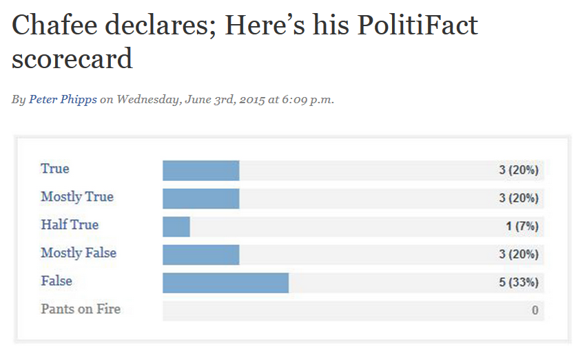
PolitiFact RI presents Lincoln Chafee's "scorecard"

Do PolitiFact's "report cards" mislead?

You betcha!

PolitiFact Rhode Island gave us former Rhode Island governor Lincoln Chafee's scorecard on June 3, 2015. As is often the case, the PolitiFact story highlighting the "scorecard" omitted any caution to readers that the results represent nothing like a social science experiment. And the story includes suggestive sentence pairings like this one (bold emphasis added):
His campaign promises showed a greater measure of constancy. Among the promises we rated, the Linc-O-Meter showed a grinning governor half the time, with 16 of 32 promises kept.
With the sentence we emphasized, PolitiFact Rhode Island implies for its readers that its "scorecard" allows readers to generalize about Chafee's campaign promises, not just the ones PolitiFact RI subjected to its brand of fact-checking.

With almost a full day's worth of comments up at PolitiFact's Facebook page (27), we already have a few that seem to show reader confusion.

"The data base is simply too small to be useful."

With a larger database the story selection process should produce a parallel objection.

"Guess telling the truth is not his strong suit."

"That looks like a terrible set of ratings. Easily poor enough for me to disqualify him as a candidate."

"At least he doesn't have any Pants on Fire."

PolitiFact admits the "report cards" do not represent a social science experiment, albeit their admission is not conspicuous enough to keep readers from making comments such as the above. People see the graph and many believe it shows some type of general truthfulness profile.

PolitiFact refuses to see the extent to which the "report cards" mislead readers, for whatever reason.

Bias, maybe?

Image from PolitiFact.com

Thursday, June 4, 2015

A report card from PolitiFact Texas

Do PolitiFact's "report cards" mislead people?

You betcha.

PolitiFact's June 4, 2015 item on Rick Perry's PolitiFact report card continues PolitiFact's pattern. There's no warning that PolitiFact does not select stories randomly. Readers just get the eye-candy bar-graph that implies a profile of Perry's general reliability.


PolitiFact editor Angie Drobnic Holan says "There's not a lot of reader confusion out there." Yet on PolitiFact's Facebook page we have comments like these:

"72 percent of his statements are not believable?"

 "15% of the time he is telling the truth."

 "only about 50% lies.??.not bad for a republican.."

 "Pretty weak when pants on fire is nearing your mostly true and true remarks."

 "Appears he has a real problem with dealing in true statements"

Those comments hint strongly at confusion. Why can't PolitiFact see it?

Wednesday, June 3, 2015

Draw conclusions with caution, Data Lounge

We say PolitiFact's report cards mislead people.

PolitiFact counters with "There's not a lot of reader confusion out there."

Who's right? We turned to the Data Lounge (a discussion board) for help:

Fact-Checking Site Finds Fox News Only Tells the Truth 18 Percent of the Time

Huh. We wonder what fact-checking site that might be?
Punditfact, a branch of Politifact, has put together profiles for CNN, MSNBC and Fox News detailing just how honest each of these networks are. And while it’s obviously not a completely comprehensive profile (it would be nearly impossible to fact check every single thing said on each network) it’s a decent measure of the honesty of each. And what do you know, Pundifact found Fox News to have only told the truth 18 percent (15 of 83) of the time for the statements they checked. And even of that 18 percent, only 8 percent of what they said was completely “True.” The other 10 percent was rated as “Mostly True.” A staggering 60 percent (50 of 83) comments were found to be either “Mostly False,” “False,” or “Pants on Fire.” The other 22 percent were rated “Half True.” Essentially well over half of what Punditfact has fact-checked on Fox News has been a lie and only 18 percent has been deemed factual. To compare, CNN was found to have been honest about 60 percent of the time, while only having 18 percent of their comments found to be false. As for MSNBC, they were found to have been honest about 31 percent of the time, while 48 percent of the comments they had fact-checked were deemed untrue. So while MSNBC’s numbers aren’t exactly worth bragging about, they’re still far better than the “fair and balanced” Fox News.
Is this one of the careful conclusions PolitiFact cautions its readers to draw about report card data?

It's the same story at Forward Progressives. Literally.

PolitiFact does not randomize its story selection. Its ratings contain at least some subjectivity (we say it's a high degree of subjectivity). Conclusions like these from Data Lounge don't follow. The report card stories mislead people.

PolitiFact editor: "There's not a lot of reader confusion out there"

In May 2015, the American Press Institute published a long article by Mark Stencel titled "How U.S. politics adapts to media scrutiny." The article made a number of observations about fact checking and included a subsection on the misuse of fact checks.

We contributed a comment noting that fact checkers commit one of the worst abuses of fact checks by publishing aggregated fact check ratings for individuals and groups. Regular readers know Jeff and I have harped on that issue for years.

Stencel, to our delight, drew comments from PolitiFact editor Angie Drobic Holan and embedded them in his reply:
As you said, I don't think any fact-checkers I know suggest their fact-checks are meant to be a random sample. But I just asked PolitiFact editor Angie Drobnic Holan to explain the "report cards" that appear on that site. As she put it, the person-by-person and group-by-group tallies PolitiFact offers are a "snapshot of what we've chosen to fact-check," presented as a "reader service" that helps PolitiFact's audience navigate their reporting.

"I think people understand that the Truth-O-Meter is not a scientific instrument," Holan added, noting that PolitiFact's editors also provide a page on the site where they explain their methods and principles (http://bit.ly/1AbmKCz). "There's not a lot of reader confusion out there," she said. And the feedback and metrics she sees tell her it's a popular feature.
We replied that readers regularly respond on Facebook to PolitiFact's "report card" articles in ways that indicate they are misled. We asked if we're supposed to believe Holan doesn't know that.

Stencel didn't reply to our second comment. And we don't blame him. He's not responsible for what PolitiFact does, after all.

His article on responses to fact checking has some good material in it, and his comment has given us a useful new tag to use when we highlight the way PolitiFact misleads its readers with "report card" stories.