Showing posts with label Report Cards. Show all posts

Tuesday, April 9, 2019

PolitiFact: 'Tweets' is to blame!


As if we needed a new reason to condemn the utility of PolitiFact's "report card" featurettes.

PolitiFact, once a candidate has accumulated 10 or more "Truth-O-Meter" ratings, features a page showing a graphic display of the distribution of those ratings. Here's a typical one:


We've always objected to these "report cards" because PolitiFact allows selection bias to serve as the basis for its datasets. In other words, the set of statements making up the basis for the graph is not representative. PolitiFact makes no effort to ensure that it is representative.

Today we ran across a fresh reason for regarding the report cards as unrepresentative. A PolitiFact fact check found that a charge against President Trump, that he was calling illegal immigrants "animals," was "False." PolitiFact's fact check notes that Democratic presidential candidates Kirsten Gillibrand and Pete Buttigieg retweeted the falsehood along with comments condemning Trump's supposed choice of words. Trump, it turned out, was referring to gang members and not ordinary illegal immigrants.

By blaming the falsehood on "Tweets," PolitiFact need not sully the report cards of Gillibrand and Buttigieg.


Bad, naughty "Tweets"!

Good, virtuous Gillibrand. Just look at that report card! No "False" and no "Pants on Fire."


The likewise good and virtuous Buttigieg does not yet have enough Truth-O-Meter ratings to qualify for a report card. He has just one "True" rating and one "Half True" rating. And you can rest assured that when Buttigieg does have a report card graphic that his retweet of a falsehood about Trump will not appear on his record. "Tweets" gets the blame instead.

With just a glance at "Tweets'" report card, one can tell "Tweets" is less virtuous than either Gillibrand or Buttigieg.


Except we're kidding because comparing the report cards is a worthless exercise.

We've repeatedly called on PolitiFact to add disclaimers to its "report cards" informing readers that the report cards serve as no useful guide in deciding which candidate to support.

We believe PolitiFact resists that suggestion because it wants its worthless report cards to influence voters. Don't vote for naughty "Tweets." Vote for virtuous Kirsten Gillibrand. Or virtuous Pete Buttigieg. It's from PolitiFact. And it's science-ish.

Wednesday, February 27, 2019

PolitiFact's sample size deception

Is the deception one of readers, of self, or of both?

For years we have criticized as misleading PolitiFact's selection-bias contaminated charts and graphs of its "Truth-O-Meter" ratings. Charts and graphs look science-y and authoritative. But when the data set is not representative (selection bias) and the ratings are subjective (PolitiFact admits it), the charts serve no good function other than to mislead the public (if that even counts as a good function).

One of our more recent criticisms (September 2017) poked fun at PolitiFact using the chart it had published for "The View" host Joy Behar. Behar made one claim, PolitiFact rated it false, and her chart make Behar look like she lies 100 percent of the time--which was ironic because Behar had used PolitiFact charts to draw false generalizations about President Trump.

Maybe our post helped prompt the change and maybe it didn't, but PolitiFact has apparently instituted some sort of policy on the minimum number of ratings it takes to qualify for a graphic representation of one's "Truth-O-Meter" ratings.

Republican Rep. Matt Gaetz (Fla.) has eight ratings. No chart.

But on May 6, 2018 Gaetz had six ratings and a chart. A day later, on May 7, Gaetz had the same six ratings and no chart.

For PolitiFact Florida, at least, the policy change went into effect in May 2018.

But it's important to know that this policy change is a sham that would hide the central problem with PolitiFact's charts and graphs.

Enlarging the sample size does not eliminate the problem of selection bias. There's essentially one exception to that rule, which occurs in cases where sample encompasses all the data--and in such cases "sample" is a bit of a misnomer in the first place.

What does that mean?

It means that PolitiFact, by acting as though small sample size is a good enough reason to refrain from publishing a chart, is giving its audience the false impression that enlarging the sample size without eliminating the selection bias yields useful graphic representations of its ratings.

If PolitiFact does not realize what it is doing, then those in charge are dangerously ignorant (in terms of improving public discourse and promoting sound reasoning).

If PolitiFact realizes what it is doing wrong and does it regardless, then those in charge are acting unethically.

Readers who can think of any other option (apart from some combination of the ones we identified) are encouraged to offer suggestions in the comments section.


Afters


When do the liberal bloggers at PolitiFact think their sample sizes are big enough to allow for a chart?

Sen. George Allen has 23 ratings and a chart. So it's between 8 and 23.

Tennessee Republican Marsha Blackburn has 10 ratings and a chart. We conclude that PolitiFact thinks 10 ratings warrant a chart (yes, we found a case with 9 ratings and no chart).

Science. And stuff.


Friday, September 22, 2017

Joy Behar lies 100 percent of the time. It's from PolitiFact.

Of course the title of this post is intended solely to draw attention to its content. We do not think Joy Behar lies 100 percent of the time, no matter what PolitiFact or Politico say.

For the record, Behar's PolitiFact file as of Sept. 19, 2017:


As we have noted over the years, many people mistakenly believe  PolitiFact scorecards reasonably allow one to judge the veracity of politicians and pundits. We posted about Behar on Sept. 7, 2017, noting that she apparently shared that mistaken view.

PolitiFact surprised us by fact-checking Behar's statement. The fact check gave PolitiFact the opportunity to correct Behar's core misperception.

Unfortunately, PolitiFact and writer Joshua Gillin blew the opportunity.

A representative selection of statements?


Critics of PolitiFact, including PolitiFact Bias, have for years pointed out the obvious problems with treating PolitiFact's report cards as a means of judging general truthfulness. PolitiFact does not choose its statements in way that would ensure a representative sample, and an abundance of doubt surrounds the accuracy of the admittedly subjective ratings.

Gillin's fact check rates Behar's conclusion about Trump's percentage of lies "False," but he succeeds in tap-dancing around each of the obvious problems.

Let Fred Astaire stand aside in awe (bold emphasis added):
It appeared that Behar was referring to Trump’s PolitiFact file, which tracks every statement we’ve rated on the Truth-O-Meter. We compile the results of a person's most interesting or provocative statements in their file to provide a broad overview of the kinds of statements they tend to make.
Focusing on a person's most interesting or provocative statements will never provide a broad overview of the kinds of statements they tend to make. Instead, that focus will provide a collection of the most interesting or provocative statements the person makes, from the point of view of the ones picking the statements. Gillin's statement is pure nonsense, like proposing that sawing segments from a two-by-four will tend to help lengthen the two-by-four. In neither case can the method allow one to reach the goal.

Gillin's nonsense fits with a pattern we see from PolitiFact. Those in charge of PolitiFact will occasionally admit to the problems the critics point out, but PolitiFact's daily presentation obscures those same problems.

Gillin sustains the pattern as his fact check proceeds.

When is a subjective lie an objective lie?


In real life, the act of lying typically involves an intent to deceive. In PolitiFact's better moments, it admits the difficulty of appearing to accuse people of lying. In a nutshell, it's very dicey to state as fact a person was lying unless one is able to read minds. But PolitiFact apparently cannot resist the temptation of judging lies, or at least the temptation of appearing to make those judgments.

Gillin (bold emphasis added):
Behar said PolitiFact reported that "95 percent of what (Trump) says is a lie."

That’s a misreading of Trump’s file, which notes that of the 446 statements we’ve examined, only 5 percent earned a True rating. We’ve rated Trump’s statements False or Pants On Fire a total of 48 percent of the time.

The definitions of our Truth-O-Meter ratings make it difficult to call the bulk of Trump’s statements outright lies. The files we keep for people's statements act as a scorecard of the veracity of their most interesting claims.
Is Gillin able to read minds?

PolitiFact's fact checks, in fact, do not provide descriptions of reasoning allowing it to judge whether a person used intentionally deceptive speech.

PolitiFact's report cards tell readers only how PolitiFact rated the claims it chose to rate, and as PolitiFact's definitions do not mention the term "lie" in the sense of willful deception, PolitiFact ought to stick with calling low ratings "falsehoods" rather than "lies."

Of course Gillin fails to make the distinction clear.

We are not mind readers. However ...

Though we have warned about the difficulty of stating as fact that a person has engaged in deliberate deception, there are ways one may reasonably suggest it has occurred.

If good evidence exists that a party is aware of information contradicting that party's message and the party continues to send that same message anyway, it is reasonable to conclude that the party is (probably) lying. That is, the party likely engages in willful deception.

The judgment should not count as a matter of fact. It is the product of analysis and may be correct or incorrect.

Interviews with PolitiFact's principal figures often make clear that judging willful deception is not part of their fact-checking process. Yet PolitiFact has a 10-year history of blurring the lines around its judgments, ranging from the "Pants on Fire" rating ("Liar, liar, pants on fire!") for "ridiculous" claims, to articles like Gillin's that skip opportunities to achieve message clarity in favor of billows of smoke.

In between the two, PolitiFact has steadfastly avoided establishing a habit of attaching appropriate disclaimers to its charts and graphs. Why not continually remind people that the graphs only cover what PolitiFact has rated after judging it interesting or provocative?

We conclude that PolitiFact wants to imply that some politicians habitually tell intentional falsehoods while maintaining its own plausible deniability. In other words, the fact checkers want to judge people as liars under the deceptive label of nonpartisan "fact-checking" but with enough wiggle room to help shield it from criticism.

We think that is likely an intentional deception. And if it is intentional, then PolitiFact is lying.

Why would PolitiFact engage in that deception?

Perhaps it likes the influence it wields on some voters through the deception. Maybe it's just hungry for click$. We're open to other explanations that might make sense of PolitiFact's behavior.

Tuesday, October 18, 2016

Current Affairs: "Why PolitiFact’s 'True/False' Percentages Are Meaningless"

We're not sure how we missed this gem from Aug. 8, 2016 in Current Affairs magazine.


The author, Nathan J. Robinson, was prompted by the slew of misleading stories featuring PolitiFact "data" from its "report cards":
Scores of media outlets have used PolitiFact’s numbers to damn Trump. The Washington Post has cited the “amazing fact” of Trump’s lie rate, with bar charts showing the comparative frequency of his falsifications. The Week counted only those things deemed completely “True,” and thus concluded that “only 1 percent of the statements Donald Trump makes are true.” Similar claims have been repeated in the US News, Reason, and The New York Times

But all of these numbers are bunk. They’re meaningless. They don’t tell us that lies constitute a certain percentage of Trump’s speech. In fact, they barely tell us anything at all.
Robinson does a great job of hitting nearly every problem with PolitiFact's rating system. The article is somewhat long, but worth the investment in time.

Wednesday, September 28, 2016

PolitiFact's presidential "Pants on Fire" bias

PolitiFact Bias has tracked for years a measure of PolitiFact's bias called the "Pants on Fire" bias. The presidential election gives us a fine opportunity to apply this research approach in a new and timely way.

This measure, based on PolitiFact's data, shows PolitiFact's strong preference for Democrat Hillary Clinton over the Republican candidate Donald Trump. When PolitiFact ruled claims from the candidates as false (either "False" or "Pants on Fire"), Trump was 82 percent more likely than Clinton to receive a "Pants on Fire" rating.

Why does this show a bias at PolitiFact? Because PolitiFact offers no objective means of distinguishing between the two ratings. That suggests the difference between the two ratings is subjective. "Pants on Fire" is an opinion, not a finding of fact.

When journalists call Trump's falsehoods "ridiculous" at a higher rate than Clinton's, with no objective principle guiding their opinions, it serves as an expression of bias.


How does the "Pants on Fire" bias measure work?


Sunday, December 20, 2015

PolitiFact's Unethical Internet Fakery

What's Fake on the Internet: Unbiased fact checkers

We stumbled across a farewell post for Caitlin Dewey's rumor-debunking "What was Fake” column in the Washington Post. In the column, Dewey notes a change in the Internet hoax business, namely that rumors are often spread intentionally via professional satire sites seeking click traffic, and is calling it quits "because it’s started to feel a little pointless."

While Dewey's column focused more on viral Internet rumors than politics specifically, we were struck by the parallel between her observations and our own regarding PolitiFact. She laments that the bogus stories are so easily debunked that the people who spread the misinformation aren't likely to be swayed by objective evidence. She then highlights why hoax websites have proliferated:
Since early 2014, a series of Internet entrepreneurs have realized that not much drives traffic as effectively as stories that vindicate and/or inflame the biases of their readers. Where many once wrote celebrity death hoaxes or “satires,” they now run entire, successful websites that do nothing but troll convenient minorities or exploit gross stereotypes.
Consider that trend when you see this chart that ran with PolitiFact editor Angie Holan's NYT opinion article:


Image via NYT screengrab


The chart, complete with bar graphs and percentages, frames the content for readers with a form of scientific legitimacy. But discerning anything from the aggregate total of their ratings amounts to pure hokum. The chart doesn't provide solid evidence of anything (with the exception of PolitiFact's selection bias), but it surely serves to "vindicate and/or inflame the biases of their readers."

We've gone into detail explaining why PolitiFact's charts and report cards amount to junk science before, but simply put there's multiple problems:

1) PolitiFact's own definitions of their ratings are largely subjective, and their standards are applied inconsistently between editors, reporters, and individual franchises. This problem is evidenced by having nearly identical claims regarding a 77-cent gender wage gap being rated everywhere from True to Mostly False and everything in between.

2) Concluding anything from a summary of PolitiFact's ratings assumes each individual fact check was performed competently and without error. Further, it assumes PolitiFact only rates claims where actual facts are in dispute as opposed to opinions, predictions, or hyperbolic statements.

3) PolitiFact's selection bias extends beyond what specific claim to rate and into what specific person to attribute a claim to (something we've referred to as attribution bias). For example, an official IG report included an anecdote that the government was paying $16 for breakfast muffins. Bill O'Reilly, ABC and NPR all reported the figure in the report. PolitiFact later gave Bill O'Reilly a Mostly False rating for repeating the official figure. This counts as a Mostly False on his report card while ABC, NPR, and even the IG who originally made the claim are all spared this on their "truthiness" chart.

4) The most obvious problem is selection bias. Even if we assume PolitiFact performed their fact checks competently, applied their standards consistently, and attributed their ratings correctly, the charts and report cards still aren't evidence of anyone's honesty. Even PolitiFact admits this, contrary their constant promotion of their report cards.

To illustrate PolitiFact's flaw consider investigating a hundred claims from President Truman to determine their veracity. Suppose you find Truman made 20 false claims, and you then publish only those 20 False claims on a chart. Is this a scientific evaluation of Harry Truman's honesty? Keep in mind you get to select which claims to investigate and publish. Ultimately such an exercise would say more about you than Harry Truman. The defense that PolitiFact checks both sides falls flat (PolitiFact get's to pick the True claims too, and in any event is an appeal to the middle ground).

We've documented how PolitiFact espouses contradictory positions on how to use their data. PolitiFact warns readers they're "not social scientists," but then engages in a near constant barrage promoting their "report cards," claiming they're useful for showing trends.

Whenever PolitiFact promotes charts like the one posted in the NYT article, the overwhelming response on Facebook and Twitter is to send the chart viral with unfounded claims that the conservative bogeymen are allergic to the truth. How can PolitiFact ethically promote such assertions when they know their report cards offer no objective data about the people they rate?

Instead of telling readers to discount any conclusions from their misleading charts, PolitiFact actively encourages and promotes these unscientific charts. That's not how honest, professional journalists seeking truth behave. On the other hand, it's behavior we might expect from partisan actors trolling for web traffic.

So why are people so intent on spreading PolitiFact's bogus charts based on bad information? Perhaps Dewey uncovered the answer:
[I]nstitutional distrust is so high right now, and cognitive bias so strong always, that the people who fall for hoax news stories are frequently only interested in consuming information that conforms with their views — even when it’s demonstrably fake.
No worries, though. PolitiFact editor Angie Holan assures us "there's not a lot of reader confusion" about how to use their ratings.

We're bummed to see Dewey close down her weekly column, as she arguably did a more sincere job of spreading the truth to readers than PolitiFact ever has. But we're glad she pointed out the reason hoax websites are so popular. We suggest the same motivation is behind PolitiFact publishing their report cards. Is there much difference between hoax sites spreading bogus rumors and PolitiFact trolling for clicks by appealing to liberal confirmation bias with its sham charts and editorials masquerading as fact checks?

Contrary to being an actual journalistic endeavor, PolitiFact is little more than an agenda-driven purveyor of clickbait.

Tuesday, June 16, 2015

Reader confusion on PolitiFact's Trump report card?

We have it from PolitiFact editor Angie Drobnic Holan that not much reader confusion exists about PolitiFact's candidate and network report cards. Readers supposedly know the report cards do not represent a scientific attempt to gauge the truthfulness of candidates.

We find Holan's claim laughable.

We often see PolitiFact's readers expressing their confusion on FaceBook. The Donald Trump presidential candidacy, predictably accompanied by PolitiFact highlighting Trump's PolitiFact "report card" offers us yet anther opportunity to survey the effects of PolitiFact's deception.
  • "65% False or Pants on Fire.
    He's a FoxNews dream candidate"
  • "admittedly, 14 is a small sample size but 0% true!"
  • "Only 14 % Mostly True ??? 86 % from Half true to Pants on Fire - FALSE !!! YES - THIS IS THE KIND OF PERSON WE NEED IN THE WHITE HOUSE."
  •  "0% true? Now, why doesn't that surprise me?"
  •  "True zero percent of the time - zero. Great word, zero. Sums up this man's essence well I think"
  • "I believe this is the worst record I've seen?"
  • "Wow 0% true"
  • "Not one single true . sounds right"
  • "Profile of a habitual LIAR !"
  • "Just what we need another republican that can't tell the truth !!"
  • "His record is better than I expected, but still perfectly abysmal."
  • "I realize that Politifact doesn't check everything politicians say, but zero percent true? That's outrageous."
  • "You'd think the GOP would disqualify him for never telling the whole truth."
  • "Zero percent "true"!"
  • "He should do well with a record like that, lol!"
  • "Not a great record in the accuracy department."
  • "Never speaks the truth!!!!"
  • "This looks like the record of a pathological liar."
Occasionally a Facebook commenter gives us hope:
People who believe these percentages are the fools. It's a well known thing called "selection bias". It refers to the FACT they have not checked every statement he has made just a very few. The percentages given are from those their [sic] selected. It's a well known way to lie about someone and is commonly used by left wing media and is meant to inflame their base to believe everything they read that agrees with their own beliefs.
"There's not a lot of reader confusion out there." Right. Sure.

Saturday, June 6, 2015

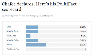
PolitiFact RI presents Lincoln Chafee's "scorecard"

Do PolitiFact's "report cards" mislead?

You betcha!

PolitiFact Rhode Island gave us former Rhode Island governor Lincoln Chafee's scorecard on June 3, 2015. As is often the case, the PolitiFact story highlighting the "scorecard" omitted any caution to readers that the results represent nothing like a social science experiment. And the story includes suggestive sentence pairings like this one (bold emphasis added):
His campaign promises showed a greater measure of constancy. Among the promises we rated, the Linc-O-Meter showed a grinning governor half the time, with 16 of 32 promises kept.
With the sentence we emphasized, PolitiFact Rhode Island implies for its readers that its "scorecard" allows readers to generalize about Chafee's campaign promises, not just the ones PolitiFact RI subjected to its brand of fact-checking.

With almost a full day's worth of comments up at PolitiFact's Facebook page (27), we already have a few that seem to show reader confusion.

"The data base is simply too small to be useful."

With a larger database the story selection process should produce a parallel objection.

"Guess telling the truth is not his strong suit."

"That looks like a terrible set of ratings. Easily poor enough for me to disqualify him as a candidate."

"At least he doesn't have any Pants on Fire."

PolitiFact admits the "report cards" do not represent a social science experiment, albeit their admission is not conspicuous enough to keep readers from making comments such as the above. People see the graph and many believe it shows some type of general truthfulness profile.

PolitiFact refuses to see the extent to which the "report cards" mislead readers, for whatever reason.

Bias, maybe?

Image from PolitiFact.com

Sunday, April 12, 2015

Are PolitiFact's "report cards" misleading?

One of our recurrent themes at PolitiFact Bias concerns the misleading nature of PolitiFact's "report cards." PolitiFact admits it does not perform its fact checks on a scientific basis, particularly in that story choices do not occur randomly. Despite that, it's utterly common for PolitiFact to publish a "report card" story encouraging readers to consider a candidate's "report card."

The latest such asks readers to consider the record of just-announced presidential candidate and former Secretary of State Hillary Clinton.

The reader comments from PolitiFact's Facebook page offer us a window into the degree of deception PolitiFact achieves with its "report card" stories.

We'll omit the names to save these individuals unnecessary embarrassment.

"When you compare the overall honesty of Democrats vs. Republicans, it's no wonder that some Republicans believe that fact checking web sites are liberally biased. It's an easier explanation then the reality that Republicans tend to lie more."

"Better than Ted Cruz."


"Comparison: Clinton, true or mostly true = 48%; Rand Paul, true or mostly true = 15%; Ted Cruz, true or mostly true = 8% (from PolitiFact archives)."

"
I would love to see a chart comparison against the other candidates. Paul's record would be a joke, his pants have been on fire so much the fire department had to move into a spare room"


"Still not a Hillary fan, but at least she's more honest that the right wing."

"Not a bad record."

Many more after the break! 

Thursday, February 19, 2015

PolitiFact's latest survey on Rush Limbaugh

We've long criticized PolitiFact's habit of presenting its "report cards" summing up its findings on political personalities and the like. Of course the report cards are non-scientific and should not be used to generalize about those personalities.

Yet PolitiFact continues to publish them. Apparently they can't resist throwing out this type of click bait.

Screen capture cropped from from PolitiFact.com's Facebook page

Of Rush Limbaugh, PolitiFact says "He has yet to receive a rating of True."

So what?

If the scorecard featured a randomized set of fact checks, then it might mean something about Limbaugh that he hasn't received a "True" rating from PolitiFact. But lacking any such randomization, the results say something about PolitiFact, not Limbaugh. And it's the predictable results of publishing these silly scorecard stories that makes the practice particularly wrong:


Screen capture cropped from DailyKos.com

It's a survey! You know, like a scientific survey using a randomized population of fact checks. Except it's not.

Allen Clifton at "Forward Progressives" foreshadowed PolitiFact's hightlighting of Limbaugh's record. More than a coincidence?

The folks at PolitiFact have to know that people get misled by these scorecards. Yet they keep highlighting them anyway, often with no warning about the unscientific nature of the [ahem] survey.

What does that say about PolitiFact?